Some times I need create fixed horizontal lines in excel charts, to indicate threshold for example.
This is my easy procedure to put this kind of lines:
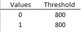
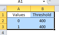
Step 1) Put the threshold values in a 2 Cells of Excel. These are the start and end values
Step 2) Create the chart with a data array
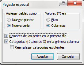
Step 3) Add a new range with the 2 values of the threshold. Select the cells of the thresold values, with the titles, to copy and paste special like a new serie.
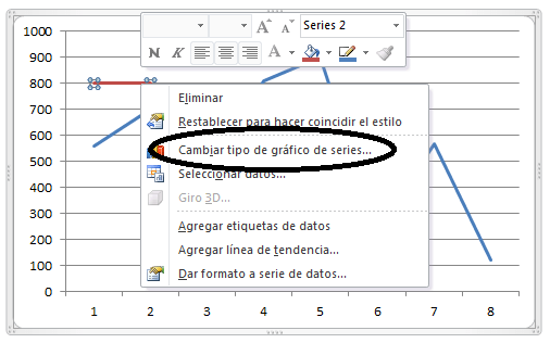
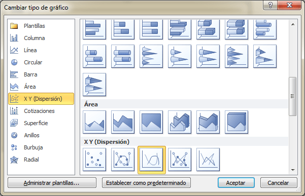
Step 4) Now you must change el kind of series graph:
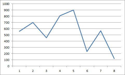
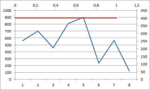
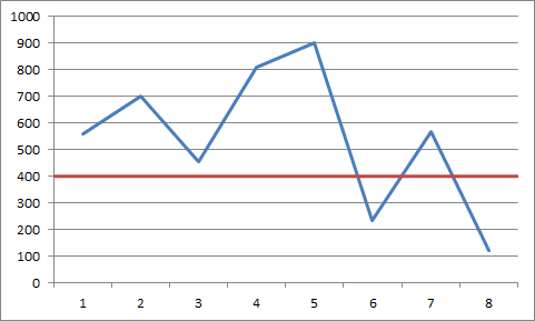
Step 5) And you will have this chart
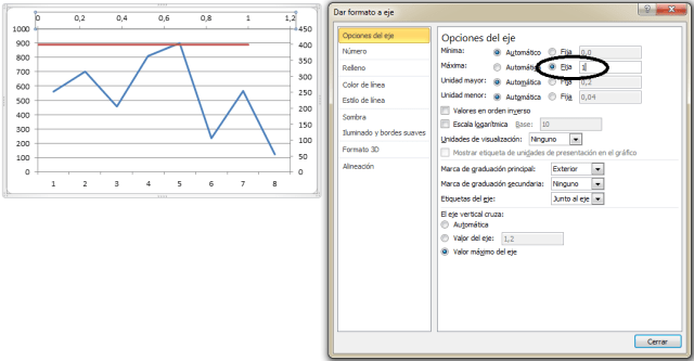
Step 6) Change the options of the axis to arrive to the end of the chart
Step 7) Delete the secondary axis and you’ll have the desired graphic
Enjoy!!!
